Widget configuration
Learn about general FeedbackFlow Widget configuration properties.
Classes
The widget will always have the .feedbackflow-widget class. You can use this class to style the widget. When used as a
floating action button, the widget will also have the .feedbackflow-action-widget class.
Configuration
The FeedbackFlow widget gets its configuration from the data- attributes in the script tag that loads the widget. You
can customize the widget by setting the following attributes.
| Attribute | Description | Default value |
|---|---|---|
data-id | The project ID of the FeedbackFlow project you want to collect feedback for. | - |
data-auto-inject | Automatically inject the widget into the page. If set to | true |
data-* | Any other attribute will be passed to the widget as a custom attribute. You can use these attributes to send additional data to FeedbackFlow when the item is created. | - |
Widget attributes
Any attribute that starts with data- will be sent to FeedbackFlow when the item is created. You can use these
attributes to send additional data to FeedbackFlow. The attributes are visible in the item's details in the dashboard
under the Widget attributes section.
Widget attributes get passed to your integrations as well. For example, if you have a Jira integration set up, the widget attributes will be added to the description of the issue created in Jira.
Automatic vs manual injection
If you set data-auto-inject to true, the floating action widget is automatically injected into your page. If you set
it to false, you need to do it manually.
Manual injection
The FeedbackFlow widget exposes a global FeedbackFlow object that you can use to manually inject the widget into the
page.
const widget = FeedbackFlow.createWidget();The returned widget object has the following methods:
remove(): removes the widget from the DOM.
UI customization
The widget offers two customization options:
- CSS variables and/or
- custom CSS.
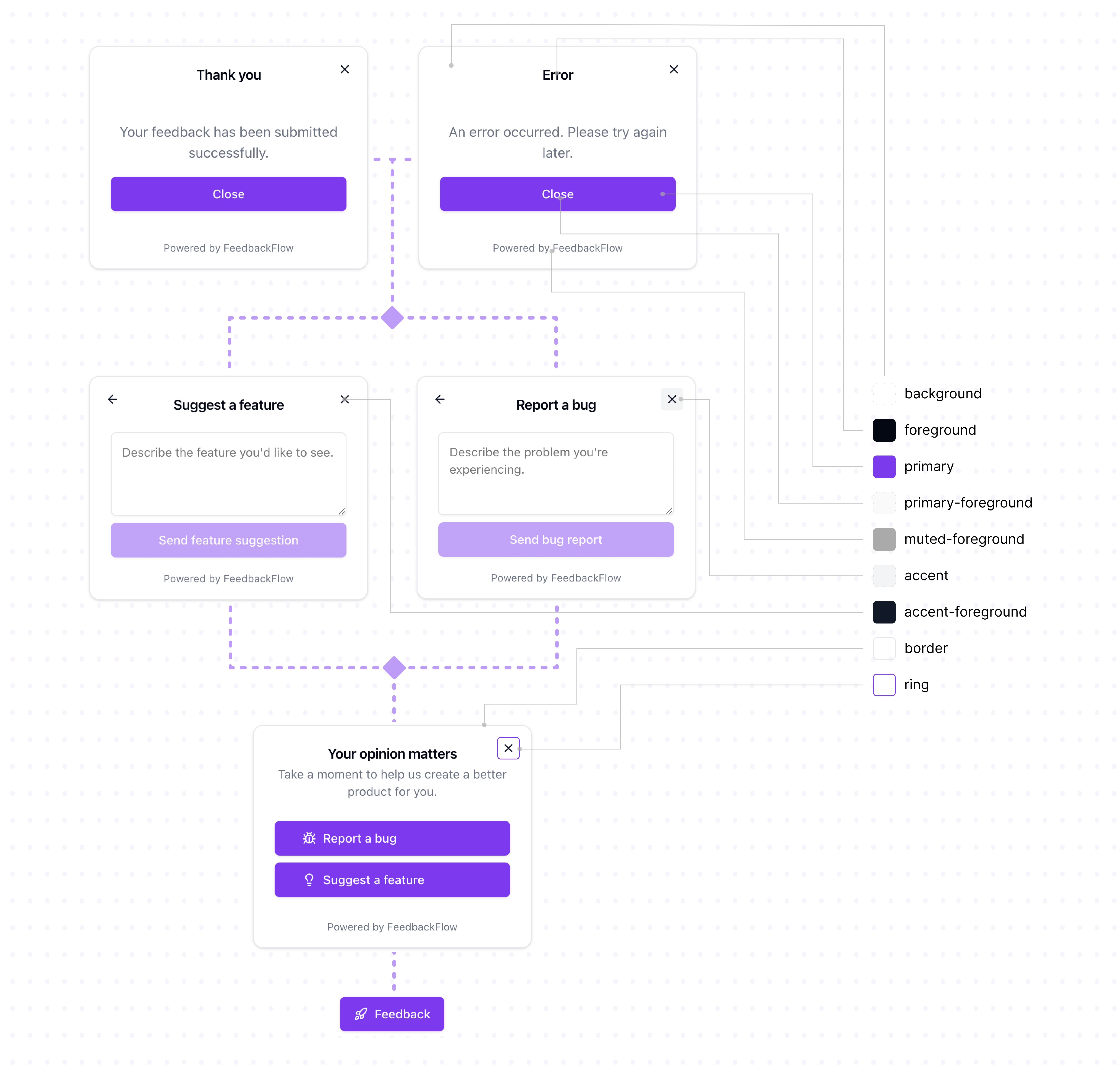
CSS variables
The widget uses CSS variables to define its appearance. You can override the default values by setting the variables in your application's CSS. The values of the variables are in HSL format.
These are the default values:
.feedbackflow-widget {
  --background: 0 0% 100%;
  --foreground: 240 10% 3.9%;
  --primary: 240 5.9% 10%;
  --primary-foreground: 0 0% 98%;
  --muted-foreground: 240 3.8% 46.1%;
  --accent: 240 4.8% 95.9%;
  --accent-foreground: 240 5.9% 10%;
  --border: 240 5.9% 90%;
  --ring: 240 10% 3.9%;
}
Custom CSS
If you want to customize the widget further, you can add custom CSS to your application.
An example of changing the font family:
.feedbackflow-widget {
  font-family: monospace;
}
Next steps
The FeedbackFlow widget is now configured. Read more about advanced widget use cases to learn how to insert the widget into a specific element on the page.